I prefer to avoid making “decks” whenever possible.
But, when there is a need to create one, and when the circumstances allow for it, I prefer making highly visual ones rather than those that include a lot of text.
After all, “a picture is worth a thousand words.”
When adding images to slides, I always make sure I avoid the six mistakes that I outline below.
Mistakes that I’ve seen in countless presentations ranging from those made by students all the way to ones made by executives and government officials.
Mistakes that can be avoided very easily, resulting in a presentation that is much more pleasant to look at and that looks much more professional.
So what are they?
#1: Insufficient Resolution
By far the most basic thing to get right when inserting a picture into a presentation (or anywhere else for that matter) is the picture’s resolution.
Unless you’re sending your presentation by email and it contains many large pictures, it’s not a big deal if the resolution is too large.
But, using a picture with insufficient resolution – in other words, stretching a picture too much – will make your presentation look bad whether you send it through email, present it on an HD monitor, or print it out.
![]()
The easiest way to avoid this is, of course, to get hold of a high-resolution version of the image you are about to use if possible or to find another similar but high-resolution image.
Alternatively, you can try to find a way to incorporate the small image into the slide in a way that doesn’t stretch it beyond its limits. Whether that means introducing some white space around the picture or adding some other elements such as text or other pictures to the slide.
#2: Wrong Proportions
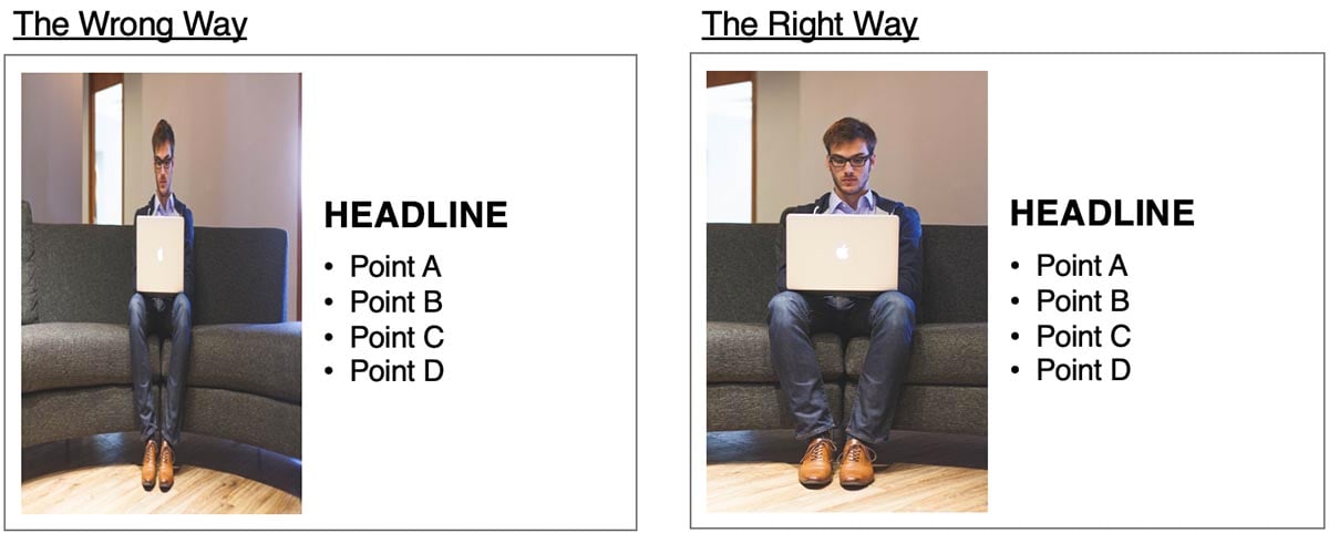
So you put a high-resolution picture into your presentation, but its aspect ratio doesn’t fit the aspect ratio of the space you wanted to insert it into…
You have two options to deal with the problem.
The first – and the wrong – way to deal with it is to resize one of the picture’s sides and change the original picture’s aspect ratio along the way. In other words, to turn the picture from a nice one to one where the people (or any objects) in it look fatter, slimmer, taller, or shorter than they actually are.
Doing it this way makes slides look bad and unprofessional, but unfortunately, I see slides with this problem – just like with the previous one – quite often.
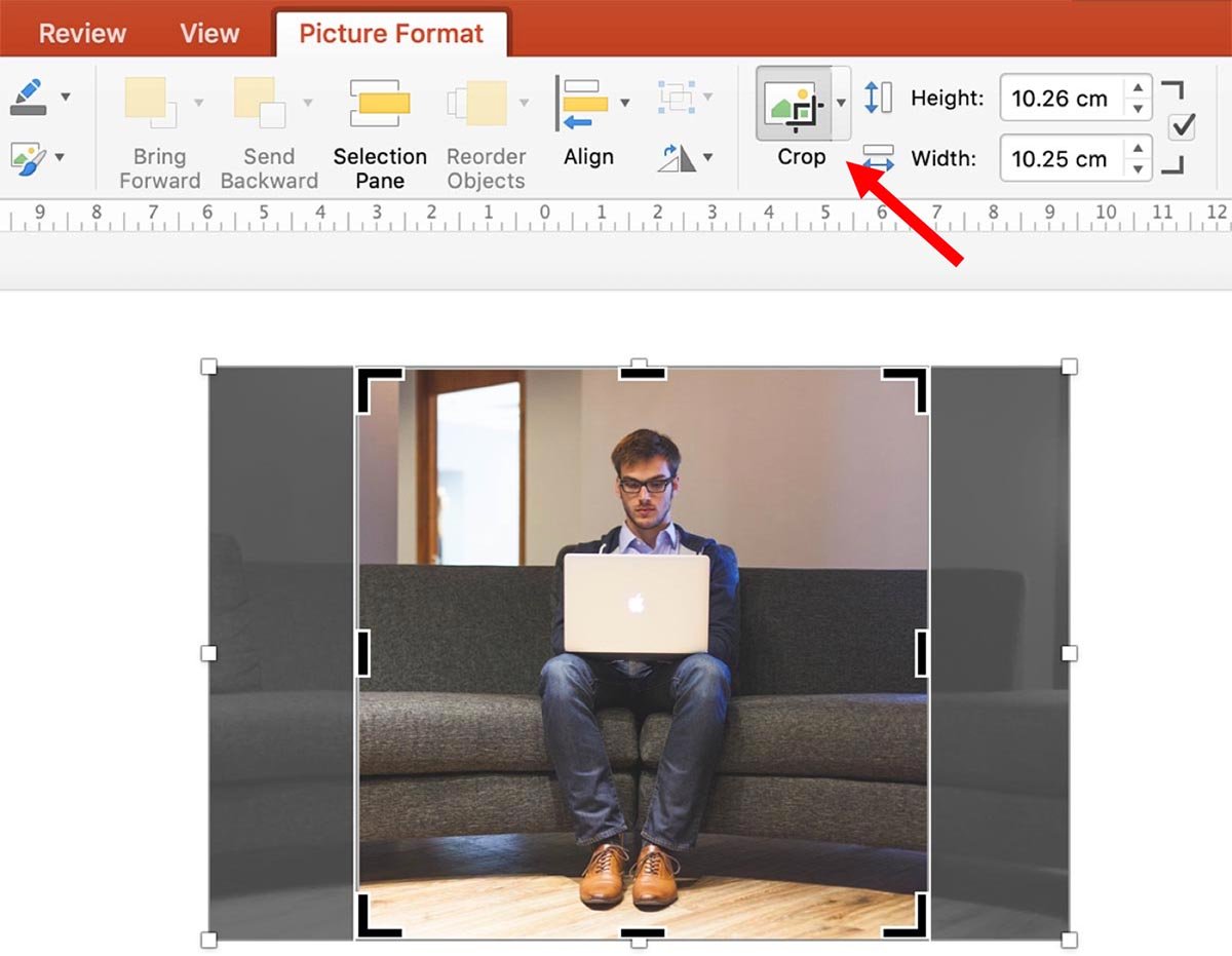
The second – and the right – way to deal with it is to crop (to cut out) the picture to the aspect ratio you need.

In PowerPoint, you can do this by clicking “Crop” in “Picture Format” menu and moving the black markers into the shape you need.
Besides that, also avoid using the white markers on the sides, the top, and the bottom of an image to resize it as doing so will distort its aspect ratio. Instead, only use the ones in the corners which (by default) should keep the aspect ratio intact.

#3: Background Mismatch
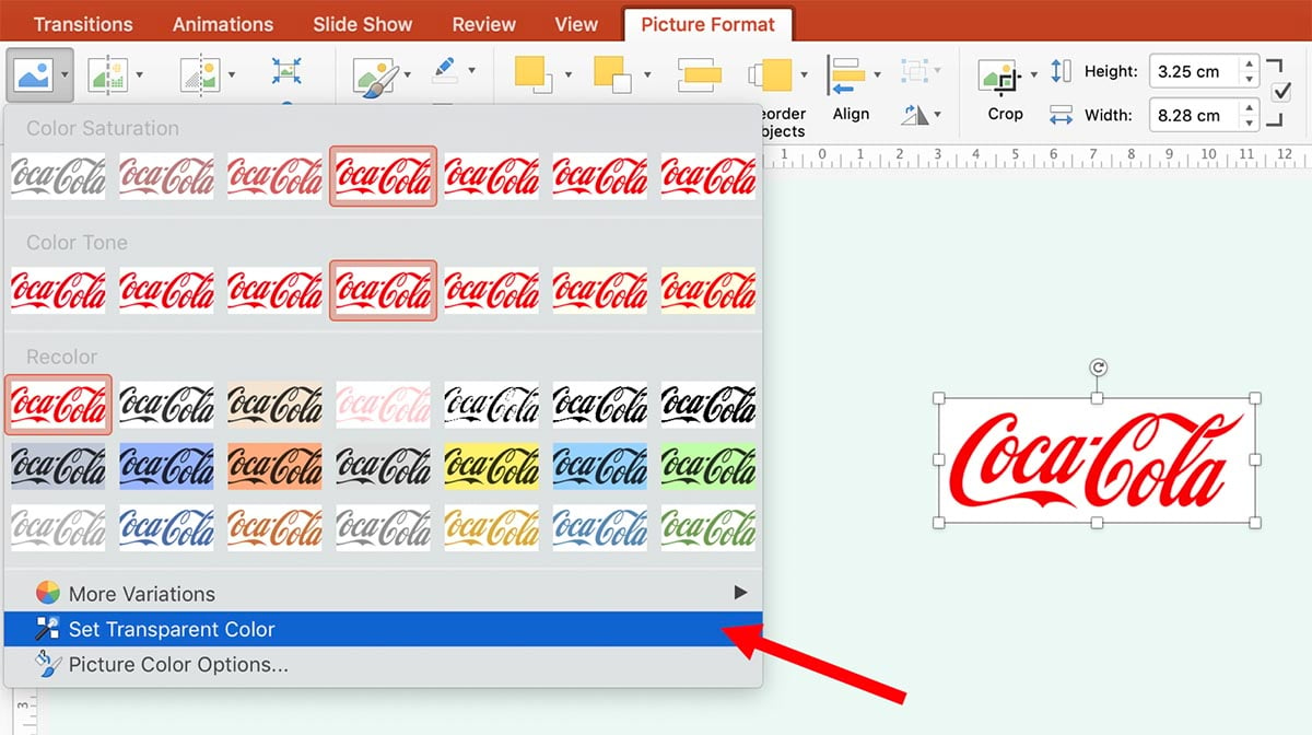
The most common victims of mistake number three are “Our Clients” and similar slides that feature company logos. Especially so if the slide’s background color is not white.

In most cases, you can fix this mistake easily by going to “Color” in PowerPoint’s “Picture Format” menu and using the “Set Transparent Color” tool (also works in other Microsoft Office products). That will allow you to click on the image’s background and set that color to the transparent color.
In some cases, you might need to use Photoshop.
If you have trouble removing the logo’s (or other image’s background), then at least make the slide consistent by having each of the logos be in a white box of the same size or something similar.

#4: Inconsistent Style
Let’s say you are a real estate agency owner and are making a presentation deck to impress a landlord enough to let you promote his property.
You ask your assistant to make a slide that shows how many agents work for you, how many properties you already sold, and how much money those deals generated.
To make it a bit more visual, you ask the assistant to add an icon for each of the three metrics.
Assuming you receive the two slides below, which one do you pick?

I would go with option 2 without any thought and hope that so would you.
Regardless of whether I like the icons themselves or not, at least they are consistent.
On the other hand, in option 1, the three icons work together about as good as letters in a ransom note.
While getting the images to be consistent throughout a single slide is a good start, ideally, they should be consistent across the whole presentation deck.
Actually, in a perfect scenario, the images you use should be consistent across all the presentations (and other materials) you and your colleagues create within your organization.
#5: Unreadable Text
Rather than having to do with the image itself, mistake number five is related to how you place your text into a slide with an image and the way it affects the text’s readability.
Every now and then I see slides where the text color blends with the background or where a line of text is placed over a “busy” part of an image.

While there are some more advanced ways of avoiding that including adding a background with transparency to the text or adding an outline to the text, there are two really easy ways to avoid making this mistake.
The first one is, obviously, not to have any text in the picture itself at all.
The other way is to place text over dead space in an image and make sure the font color is distinguishable enough from the background.

#6: “The Wrong” Picture
The final mistake I will mention is also the most difficult one to fix (or to even determine whether it’s a mistake) since it’s so subjective. I’m talking about the mistake of using an image that is not suitable to convey the point you are trying to make.
The two questions you should be asking to avoid this mistake are:
- Does the image portray the point of the slide well?
- Are there any inconsistencies between the image and what the slide says?
While answering the first question can be fairly difficult and subjective, the second question should be easier to answer, and thus – if the answer is yes – easier to fix.
Just as an example, imagine you were making a slide about what laptops students at your school use and the data said that 80% of them use Toshiba, 10% use Lenovo, and 10% use Apple.
Rather than using a picture of a MacBook to make the slide more visual and just “illustrate the point” that you are talking about laptops, you would want to use a picture of a Toshiba laptop (even though you might think a MacBook looks better) – and thus stress the point that Toshiba was the most popular brand in the survey.

Summary
Whether you are using PowerPoint or Keynote to make a presentation, images are a great way to enhance your presentation.
That said, just “throwing an image onto a slide” is not sufficient enough.
The images you use have to be consistent in style, consistent with the content of the slide, and of quality that is sufficient enough for the intended use – whether that is presenting it on an HD monitor or printing it out on a paper.
While choosing the right image for a slide can be a highly subjective matter, avoiding the six mistakes outlined above – especially not using images of too low resolution and not stretching images out of their original aspect ratio – should be a good start in making your next presentation look clean and professional.